XKCD Style Graphs With R
With statistical proof I'm bad at CrossFit.

Hey hey! I'm a developer who lives in Orlando, FL. Right now I work at Code School, listen to a lot of audiobooks, set way too many goals, write at minafi.com and tweet often.
Two years I started doing CrossFit and have since gotten kind of into it. After the CrossFit Open last year, I decided to dive a little deeping into the stats available and was able to prove, using public data, that I’m not very good at CrossFit.
Even still, the data set was amazing – over a hundred thousand people participated in a series of workouts, with details like height, age, gender and weight on most of them. With this I started looking for patterns. Do taller people do better at a specific movement? How much does experience in CrossFit affect ranking? This lead me down a rabbit hole that is the statistics community.
Getting Started with R

I got my introduction to R when writing the JavaScript/HTML front-end for Code Schools Try R course. Jay McGavren did an amazing job on the content. I still laugh thinking about finding the mean number of limbs in a group of pirates who had obviously been through some hard times.
Try R is still one of my favorite Code School courses. It’s free, and only takes about an hour to go through. It also introduces some of the core concepts of R that come in handy reading the code below.
(Re)Learnings Statistics
Coursera has some amazing courses on statistics.
Like most people, I took some statistics in college, but don’t use too much of it on a daily basis. Lucky for me, Coursera has some amazing stats classes. The one I ended up going through was called Statistics: Making Sense of Data, which hit close to what I was wanting to learn.
One of the nice parts about the format was it was taught similar to how it would be taught at a university – with the main instructors teaching the statistics side, then with shorter followup videos detailing how to do the same thing in R.
A Boxplot Graph
Armed with new information about how to draw information from… other information, I went ahead and started making my first graph – a handy boxplot. With all the information loaded into a Postgres database and put together the following script.
1 2 3 4 5 6 7 8 9 10 11 12 13 14 15 16 17 18 19 20 21 22 23 24 25 26 27 28 29 | # Setup Postgres connection library('RPostgreSQL') drv <- dbDriver("PostgreSQL") con <- dbConnect(drv, dbname="crossfitopen_development") # Query the database rs <- dbSendQuery(con,"select info_time_crossfitting, wod1_score from athletes where mens=FALSE and info_time_crossfitting is not null and wod1_score > 5") # Load in our 70k rows results <- fetch(rs,n=-1) # Give names to our columns colnames(results) = c('Experience', 'Score') # Create R variables for each column in the database # Creates: # Experience vector # Score vector attach(results) # Order our Experience vector Experience = factor(Experience, c('Less than 6 months', '6-12 months', '1-2 years', '2-4 years', '4+ years', 'Decline to answer')) # Create Barplot! boxplot(Score~Experience, range=0, main='WOD 13.1 By Experience (Women)') |
This pulled up an easy to understand Boxplot.
Statistical proof I’m bad at CrossFit
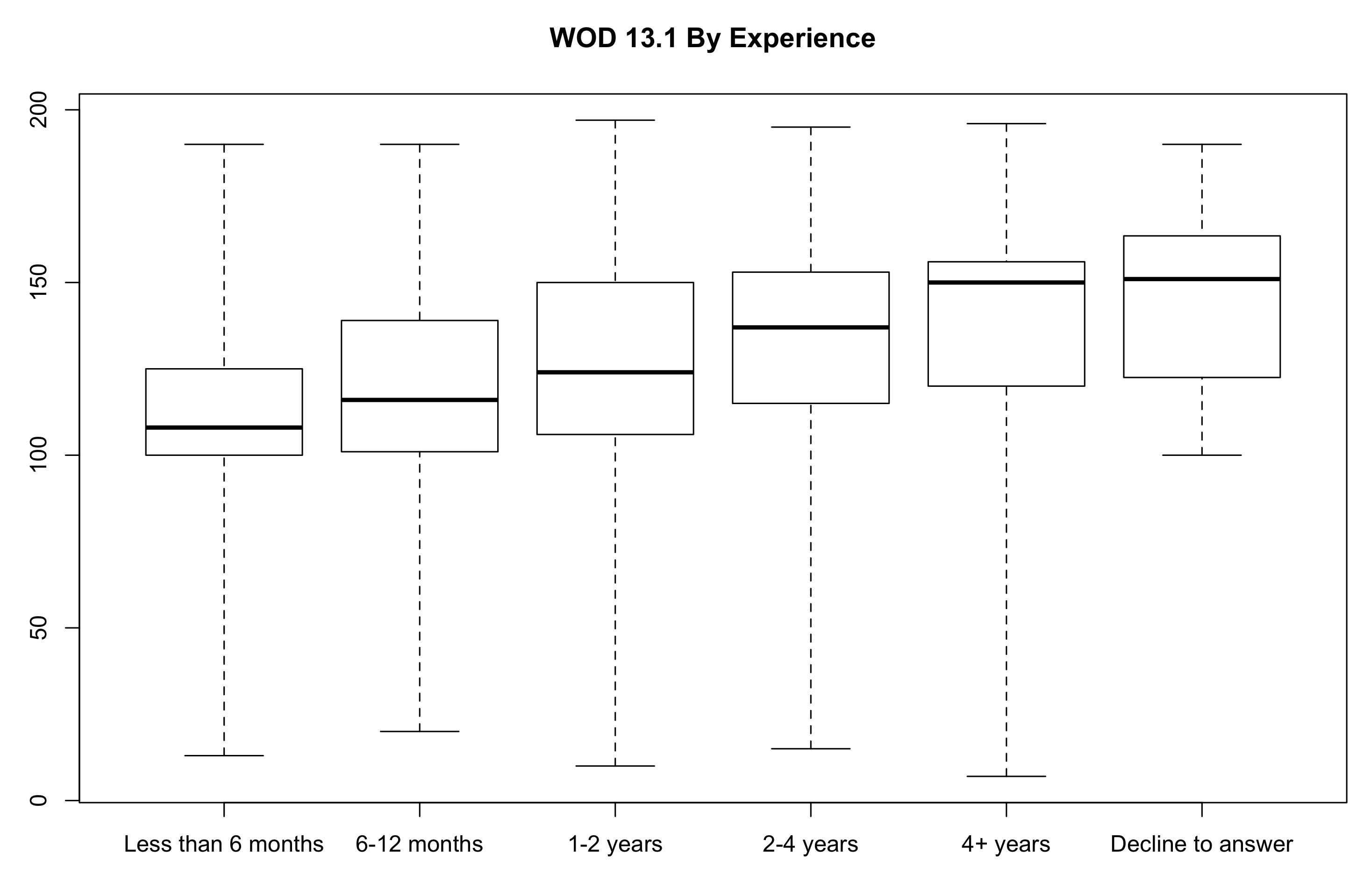
Each vertical box represents what 50% of the popuplation on that vertical achieved, with the line inside the boxplot representing the median for that segment. Seeing as how I’d been CrossFitting for 1-2 years, and only scored 100 on this workout, I was sad to see my score was in the bottom 25% for my group. I knew I had to look deeper to see how I compared.
Having Fun With XKCD
I stumbled upon the XKCD Package For R not too long after, and decided to have some fun with this data. This library is plain out amazing, and impressive. Looking at the examples on the page alone I knew it was way over my head being still very new to R. But with one chart in mind – my ranking on the 5 workouts – I decided to start writing a graph using the XKCD style.
1 2 3 4 5 6 7 8 9 10 11 12 13 14 15 16 17 18 19 20 21 22 23 24 25 26 27 28 29 30 31 32 33 34 35 36 37 38 39 40 41 42 43 44 45 46 47 48 49 50 51 52 53 54 55 56 57 58 59 60 61 62 63 64 65 | library(extrafont) loadfonts() library(xkcd) # Bring in the data! # workout=c(1:5) - creates a range from 1-5, so 1,2,3,4,5 # c(16...) - These are my percentiles for the five workouts, resepectively scores <- data.frame(workout=c(1:5), rank=c(16.71, 4.21, 19.61, 4.9, 19.38)) # Define how much of the X and Y access to show. # In our case, we'll show all of the Y access, # but only 1-5 on the X access side. xrange <- range(scores$workout) yrange <- range(c(0,100)) ratioxy <- diff(xrange) / diff(yrange) # Let's create XKCD style stick figure # I blatantly copied this part from the sample code mapping <- aes(x, y, scale, ratioxy, angleofspine , anglerighthumerus, anglelefthumerus, anglerightradius, angleleftradius, anglerightleg, angleleftleg, angleofneck) # The c(1.5,4.5) reprents the X coordinates of each of the 2 stick figures -- # likewise for the y coordinate. The rest of these control the arms and legs dataman <- data.frame( x= c(1.5,4.5), y=c(80, 70), scale = 17, ratioxy = ratioxy, angleofspine = -pi/2 , anglerighthumerus = c(-pi/6, -pi/6), anglelefthumerus = c(-pi/2 - pi/6, -pi/2 - pi/6), anglerightradius = c(pi/5, -pi/5), angleleftradius = c(pi/5, -pi/5), angleleftleg = 3*pi/2 + pi / 12 , anglerightleg = 3*pi/2 - pi / 12, angleofneck = runif(1, 3*pi/2-pi/10, 3*pi/2+pi/10)) # Those squigly lines that connect text to a character are easy to draw. # Each needs an x/y start point and an x/y end point. The library does the rest. datalines <- data.frame(xbegin=c(1.9,4.2,2), ybegin=c(80,70,77), xend=c(2.1,3.9,2.8), yend=c(88,80,68)) # Using ggplot to do the actual graphing -- an versatile graphing library for R p <- ggplot() + geom_smooth(mapping=aes(x=workout, y =rank), data=scores, method="loess") # Do ALL the generating! # This includes putting everything together and adding the sample text we want to write. # Of course, this text should be written using the xkcd font. p + xkcdaxis(xrange,yrange) + ylab("Percentile") + xkcdman(mapping, dataman) + annotate("text", x=2.4, y = 93, label = "There's a lot of\nroom up here", family="xkcd" ) + annotate("text", x=4.1, y = 83, label = "Let's do 7 minutes of Burpees!", family="xkcd" ) + annotate("text", x=2.8, y = 62, label = "I will use your face\nas a wallball target...", family="xkcd" ) + xkcdline(aes(xbegin=xbegin,ybegin=ybegin,xend=xend,yend=yend),datalines, xjitteramount = 0.11) |
Running this in the R console, generates a pretty slick graph:
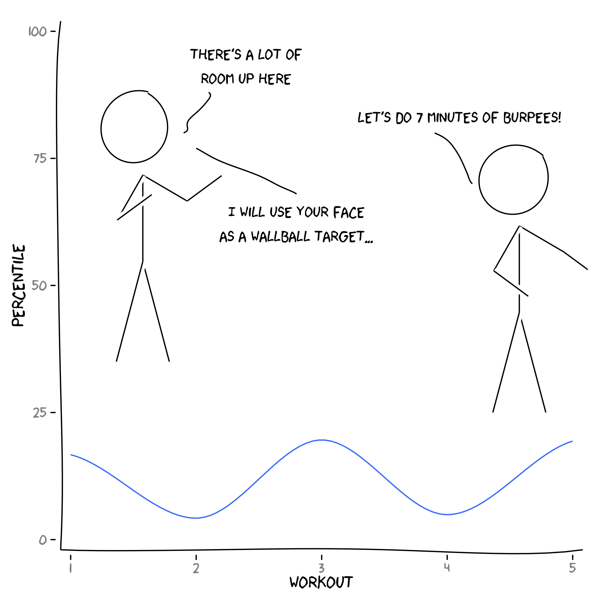
Even if I don’t see myself creating loads of XKCD style graphs, getting one made was a lot of fun.
If you’re curious what else you can do with the XKCD library, check out the documentation.
Comments